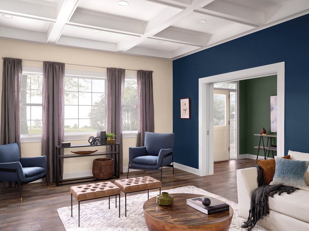
These are 6 trends in paint colors for the year 2020, including deep blue tones, bright pinks, as well as a green and a special gray to generate calm environments.
If you like to be fashionable, this is your opportunity to align your home with the latest color trends. But, on the contrary, if you don’t care about fashion, take the colors of 2020 as inspiration to change the color of the house. Whatever your position, this year’s paint colors are here to inspire us and shine in the interiors of many of the world’s homes.
Who chooses the trendy colors?
It is done by the most influential companies in the design, color, and paints globally and regionally. This is how they choose the color of the year from color references such as Pantone, but also the most recognized paint brands, such as Behr, Sherwin Williams, or AkzoNobel among others.
The teams of specialists and designers from each of the companies meet year after year to determine the color of the year. But it is not just any color, but the choice is based on many aspects such as the trend of the industry, or the cultural changes and the lifestyle that varies from year to year. In addition, each brand presents its color, as a way to remain visible in the market for potential clients, as a marketing strategy that has been working for a long time.
Although there may be certain coincidences, we always have several trendy colors for each of the brands. Some of which also select palettes or a group of compatible colors to make a suitable combination. These are some of the options this year.
Blue colors
For this year we come with several options of cold and calm tones, quite marked, without great contrasts. In this sense, two leaders of the sector have chosen blue colors as the color of the year. Blue is the trend color of all the time.
Pantone Classic Blue
The specialists of the Pantone Color Institute opted for a deep and sober blue, a color not very special, but it is particular to use indoors. With it you can create elegant and calm environments, but also modern if you combine it properly. For the overall space to look modern it is necessary to create contrasts, white, soft gray, and perhaps using accent colors like apple green, coral, mustard or turquoise.
Sherwin Williams Naval
A classic is also navy or nautical blue, which one of the most prestigious North American paint companies has called Naval. Somewhat darker than the previous one, this blue should be used with more care because it can darken an environment if it is applied on large surfaces. In this sense, it is special to highlight a wall or to be used as an accent color.
Pink colors
In contrast to the intense and dark blues, there are two alternatives, two soft and feminine colors, a pale pink and a soft coral from two well-known paint brands.
Benjamin Moore’s First Light
Like the First Light of Dawn, the North American Paint Company Color 2020 is a warm and bright color. Very entertaining and appropriate for almost any environment. FirstLight is part of a menu of 10 shades that the brand’s specialists have chosen for this year. These colors are perfect to combine with each other, which is why this soft pink is a good companion to mint green, olive green, steel blue, and corn, among others.
Pink Oyster by CIN Valentine
It takes its coloring and name from the pink oyster mushrooms, a delicious edible mushroom of tropical origin. We are in the presence of a fusion of a pink and an orange, which we usually call salmon or coral, depending on the intensity of the tonality. In this case, it is a warm and cheerful tone, but at the same time luminous, suitable for all environments, especially in those that we want a soft and renewed touch. It combines perfectly with lighter or more intense tones of the same hue, pinks, grays, cinnamon, and whites.
Dry green color
Always green hues are welcomed by many, and certainly all bring a note of freshness in the environment. They look relaxing and their perfect companion is white, although there are always others who accompany them very well.
Back to Nature by Bher
For the current year, the Behr paint company leaned towards a dry green. This is a dirty or muted shade of green, especially for indoors and outdoors. It goes perfectly with white, black, gray, and other intense greens, also beige and wood tones.
Soft gray color
Many times we have talked about gray in Casa y Color, what is the best way to use it, and how to combine it. Soft gray is a safe choice, but it tends to look dull if it’s not combined properly.
Tranquil dawn of Alba, Bruguer, and Dulux
This paint color is an ash gray, special to give a background color to the decoration of our homes. Very versatile, it can take other neutral shades as companions, but especially bright colors and dark variants.
Whether you like fashions or not, whether you follow trends or not … this is a good opportunity to choose the color that you like the most and renovate that space in your home that needs it. Changing the paint color creates new sensations and a different being.
Hope those color trend will help you.

